Recently iBall, the people with the ergonomically designed consumer electronics, came out with a cell phone aimed at senior citizens, the iBall Aasaan. This cell phone is supposed to have it all, large sized letters on the keypad, big sized font on screen display, simple one touch operation of many functions, loud volume, SOS feature etc. After reading a few reviews I bought one for my parents, whose old cell was showing distinct signs of age.
This is not meant to be a review of Aasaan but to point out that even with the best intentions, products aimed at a certain category fail to carry out the thought process through to completion.
Now, let us assume I am a senior citizen and after looking at the product and reading a few reviews I buy the cell phone. I open the attractive box in which the cell phone comes and dig down to unearth the user manual so that I can learn how to use the Aasaan.
I open the user manual and stop dismayed. See the image below to know why.
Fig 1: iBall Aasaan on top of User Manual
Did you notice why? Of course you did. The user manual would require a magnifying glass to read even for someone with normal eyesight. How on earth is the senior citizen expected to plough through this microscopic lettering? What iBall should have done was to have the user manual in 2 parts. One part, a fold out, consisting of the sections seniors would need the most to get going or frequently. This part should be with large sized lettering. It need be just a few pages and can be an FAQ like document that can be stuck on a wall. Charging the cell phone, putting in or taking out the battery, the SIM card, turning the cell on / off, etc. The other sections can be small font sized. That way the user manual would be actually usable by its target consumers AND at the same time not bulky.
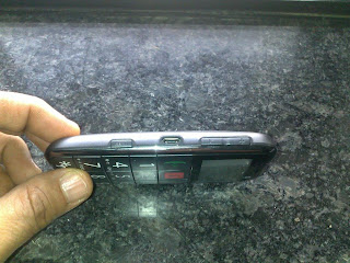
The sides of the Aasaan have four buttons / switches to enable the senior citizen to have easy access to four functions: turning on / off the torch, locking the cell phone, the FM radio and volume control. The first two are on the right and the last two on the left. See images below.
It is great that iBall have thought of having one touch buttons and switches conveniently located on the sides. But here's the thing, why not have the buttons or switches in a colour that contrasts with black, such as white or yellow?. Better still, have them glow in the dark. Right now all the four buttons are exactly the same colour as the side panel which furthermore is coloured black, not the best of colours for a product aimed at seniors. I found my father peering hard at the side panels to know what was what and what was where. He was then reduced to using touch to identify the locations since the visual cues were absent.
These lacunae in a product that is otherwise well conceived shows how important it is that all aspects of the product from the packaging, the documentation, the product need to be tested thoroughly by the target community for usability under various conditions. Re the Aasaan it is obvious that the user documentation must not have been tested with seniors. Nor was proper testing done with the side panels. Aesthetics should never be allowed to trump over function, as it seems to have done in this case.
These lacunae in a product that is otherwise well conceived shows how important it is that all aspects of the product from the packaging, the documentation, the product need to be tested thoroughly by the target community for usability under various conditions. Re the Aasaan it is obvious that the user documentation must not have been tested with seniors. Nor was proper testing done with the side panels. Aesthetics should never be allowed to trump over function, as it seems to have done in this case.


yes indeed. it just shows how important it is for all functions in the organisation to sing from the same page....keeping the consumer in the centre.
ReplyDelete